How to Create APA Style Graphs and Then Teach SPSS to Do it Automatically!
In the strictest sense, APA style discourages the use of color in graphics, stipulating that it be used only when it is "absolutely necessary". Consequently, most universities and dissertation committees also discourage (or downright forbid) the use of color graphics in dissertation manuscripts. Personally, i find this irritating, as I think most graphical representations of data can be made more clear with the appropriate use of color. However, I suppose the guideline is meant to provide uniformity and consistency across manuscripts, which is understandable.
Unfortunately, if you use SPSS you've probably already discovered that it produces graphics in color by default. Not to worry, your graphs can be changed easily. Better yet, you can make simple adjustments to your SPSS settings that will force the program to create APA-compliant (i.e. black & white) graphics in all output! Here is how you do it:
First, I'll show you how to change an individual chart (this works for a newly created chart or a chart saved in output that you created previously). In the screenshot below, you can see I'm creating a table that uses FAKE data about how many times each day people check Facebook. The line graph I am creating examines the number of Facebook checks per day by age group and by gender. Again, I want to be clear: THIS IS NOT REAL DATA, IT IS 100% FAKE.
To produce the initial graph I did the following:
- In the upper left screenshot I am choosing a "Line" graph from the "Legacy Dialogs" menu.
- In the upper right screenshot I am choosing the "Multiple" and "Summaries for groups of cases" options in the "Line Charts" dialogue box, and then clicking the "Define" button.
- In the lower left screenshot I am choosing the variables I want to include in my graph (i.e. # of Facebook checks, gender, and age), and then clicking the "OK" button.
- In the lower right screenshot you can see the resulting graph that is produced in SPSS, which is in color by default.


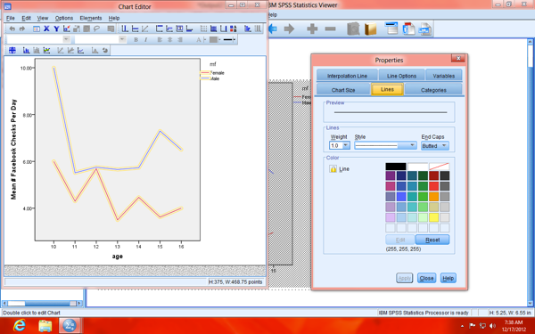
Once the graph is produced in the SPSS output, hover your mouse pointer over the graph, and you should see a message pop-up that says "Double-click to activate" (below, left). Go ahead and double-click. At that point, you should see something similar to what you see in the screenshot below and on the right. Next, click on the "Show Properties Window" icon (circled in the screenshot below and on the right).


Once the "Properties" dialogue window appears (top-left screenshot below), use the mouse pointer to click on one of the lines in the bar graph (which will highlight both lines in the graph). When the lines are highlighted, you should also notice that more tabs are now available in the "Properties" dialogue window (top-right screenshot below), including the "Variables" tab.
Next, click on the "Variables" tab, bringing it to the foreground (bottom-left screenshot below), and then use the drop-down box to change the Group Style" from "Color" to "Dash" (bottom-right screenshot below).


Next, click the "Apply" button and you should see the lines change from color to black solid lines and dashes (below, left). On a side note: you can also change which dash/dot patterns are used, but clicking on one of the lines and then clicking on the "Lines" tab in the "Properties" dialogue window (below, right), and changing the option in the drop-down menu.


The great news is that we can make SPSS do this process for us automatically, for every graphic! To accomplish this, navigate to the SPSS "Options" menu, which can be found in the "Edit" menu (top-left screenshot below). Next, click on the "Charts" tab in the large dialogue window that appears (top-right screenshot below) and change the "Style cycle preference" from "Cycle through color only" to "Cycle through patterns only". Next, change the "Font" from "SansSerif" to "Times New Roman" (bottom-left screenshot below).
Optionally, you can also adjust the order in which the dash/dot patterns are cycled through groups/categories by clicking on "Lines" in the "Style Cycles" section (circled in the bottom-left screenshot below) and adjusting the order as desired (circled in the bottom-right screenshot below). Finally, hit "Apply" and "OK", to close the large dialogue window.


You should be all set! You may need to restart SPSS for the changes to the settings to take effect, but they should be perminant otherwise. You should now see an APA-compliant table in your output now (screenshot below)!
